HTML Banner Animation tutorial
HTML Banner Animation tutorial
Jan 11, 2021 | Read time 5 minutesSee the full demo here

In this example, I will recreate an animation I found on dribble. It has 3 main components,
- the main “Get Started” hero text,
- the laptop zoom effect and
- the circular/ square expands.
The tedious bit here is the third (3) component - the two expanding circles and rectangles. My thought here is to have one big div, make it circular using border radius and then use the CSS clip property to clip sections of that div.
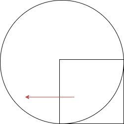
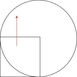
For the expanding circles, I will clip the bottom and top left sections of the main div and animate it by rotating 90 degrees.
This will give the appearance that its expanding
Animating the expanding circles using the CSS clip property
The clip property just tells which portion of an element should be visible. It takes the offset values from top, bottom, left and right. In our case we want to make a quarter of our main div visible.
Example of how to use it:
/* top, right, bottom, left */
clip: rect(1px, 10em, 3rem, 2ch);
(Note: it is recommended to use the clip-path property since this property will be deprecated in the future)
So for the first cirle, we want do the following
And for the second circle, we will do the same, but the starting position is shifted to the left:
Animating the expanding rectangles
To animate the rectangles would be simple enough - just scale up from 0 to 1.3 in the @keyframes
Additionally to make the animations smooth, I used cubic-bezier functions instead of the default ease-in/ease-out values. This gives a much more realistic feel.
HTML
The HTML is quite small - I got a main tag thats using flex layout - its not optimized for responsiveness yet :).
    <main>

        <div class="hero">

            <section>
                <h1>Get Started</h1>
                <p>Lorem, ipsum dolor sit amet consectetur adipisicing elit.</p>

                <button>CREATE ACCOUNT</button>
            </section>
        </div>

        <div>
            <img src="laptop.png" class="laptop"/>

            <div id='loading'>
                <div class='hold bottom-left'>
                    <div class='fill '></div>
                </div>

                <div class='hold top-left'>
                    <div class='fill '></div>
                </div>
                <div class='hold bottom-right'>
                    <div class='background'></div>

                    <div class='fill '></div>

                </div>

                <div class='hold top-right'>

                    <div class='fill '></div>

                </div>
            </div>
        </div>

    </main>
CSS
        :root {
            --blocksize: 450px;
            font-family: 'Montserrat', sans-serif;

        }

        .bottom-left .fill {
            background-color: #F25774;

        }

        .bottom-right .fill {
            background-color: #565AA6;
        }

        .top-left .fill {
            background-color: #565AA6;
        }

        .top-right .fill {
            background-color: #F29B9B;

        }

        #loading {
            width: var(--blocksize);
            height: var(--blocksize);
            margin: 30px auto;
            transform-style: preserve-3d;
        }

        @keyframes slideInFromBottom {
            0% {
                transform: translateY(50%);
                opacity: 0;
            }

            100% {
                transform: translateY(0);
                opacity: 1;
            }
        }

        .hero {
            padding-top: 12rem;
            padding-left: 12rem;
            animation: slideInFromBottom 2s cubic-bezier(0.5, 0, 0.2, 1) forwards;
        }

        .hero h1 {
            color: #565AA6;
            font-size: 4rem;
            padding: 0;
            margin: 0;
        }

        .hero button {
            background-color: #F25774;
            /* Green */
            border: none;
            border-radius: 0.5rem;
            color: white;
            padding: 15px 32px;
            text-align: center;
            text-decoration: none;
            display: inline-block;
            font-size: 1.5rem;


        }

        .hold {
            position: absolute;
            width: 100%;
            height: 100%;
            border-radius: 100%;
            background-color: #fff;
            top: 4rem
        }


        .bottom-left .fill {
            position: absolute;
            width: 100%;
            height: 100%;
            border-radius: 100%;
            clip: rect(calc(var(--blocksize)/2), var(--blocksize), var(--blocksize), calc(var(--blocksize)/2));

            z-index: 2;
            animation: bottom-left 0.6s cubic-bezier(0.5, 0, 0.2, 1) forwards;
            opacity: 0;

        }

        .top-left .fill {
            position: absolute;
            width: 100%;
            height: 100%;
            border-radius: 100%;
            clip: rect(calc(var(--blocksize)/2), calc(var(--blocksize)/2), var(--blocksize), 0px);

            z-index: 1;
            animation: bottom-left 0.6s cubic-bezier(0.5, 0, 0.2, 1) both;
            animation-delay: 0.6s;
            opacity: 0;

        }


        .bottom-right .fill {
            position: absolute;
            transform-style: preserve-3d;
            bottom: 0;
            width: 100%;
            height: 100%;
            clip: rect(calc(var(--blocksize)/2), var(--blocksize), var(--blocksize), calc(var(--blocksize)/2));
            animation: bottom-right 2s cubic-bezier(0.5, 0, 0.2, 1) forwards;
            z-index: 4;

        }

        .bottom-right .background {
            position: absolute;
            width: 100%;
            height: 100%;
            clip: rect(calc(var(--blocksize)/2), var(--blocksize), var(--blocksize), calc(var(--blocksize)/2));
            z-index: 3;
            animation-delay: 0.5s;

            background-color: white;

        }

        .top-right .fill {
            position: absolute;
            transform-style: preserve-3d;

            width: 100%;
            height: 100%;
            clip: rect(0px, var(--blocksize), calc(var(--blocksize)/2), calc(var(--blocksize)/2));
            animation: top-right 2s cubic-bezier(0.5, 0, 0.2, 1) forwards;
            right: 0;
            animation-delay: 0.5s;
            opacity: 0;
            top: -50px;
            ;
            z-index: 3;
        }


        @keyframes bottom-left {
            0% {
                -webkit-transform: rotate(0deg);
                opacity: 0;

            }

            100% {
                transform: rotate(90deg);
                opacity: 1;
            }
        }


        @keyframes top-left {
            0% {
                -webkit-transform: rotate(0deg);
            }

            100% {
                transform: rotate(180deg);
                opacity: 1;
            }
        }

        @keyframes bottom-right {
            0% {
                width: 0%;
                height: 0%;

            }

            100% {
                width: 100%;
                height: 100%;
                transform: scaleX(1.3)
            }
        }

        @keyframes top-right {
            0% {
                width: 0px;
                height: 0px;

            }

            100% {
                width: 100%;
                height: 50%;
                opacity: 1;
                transform: scaleX(1.3) scaleY(1.5);


            }
        }

        main {
            display: flex;
        }

        main div {
            flex: 1
        }

        .laptop{
            width: 450px;
            z-index: 10;
            top:150px;
            right:100px;
            position: absolute;
            animation: zoom 1s cubic-bezier(0.175, 0.885, 0.32, 1.275) forwards;
            animation-delay: 0.8s;
            opacity: 0;


        }

        @keyframes zoom {
            0% {
                transform: scaleX(0) scaleY(0);

            }

            100% {

                opacity: 1;
                transform: scaleX(1) scaleY(1);


            }
        }