Creating a wave effect with CSS and SVG
Use CSS and SVG to create wave effect
Feb 23, 2020 | Read time 5 minutes🔔 Table of contents
As part of a New Year’s resolution, I have been putting in 1-2 hours a day to do the #100DaysOfCode challenge. I mostly focus on front-end stuff since I am quite new at this. This post will detail how I created a wave effect using CSS animations and SVGs.
Hopefully it might be useful to you. Some links that helped me understand the basics for this:
Show me the code!
If you are too busy, just copy the following code
HTML
    <div class="waves">
            <div class="wave wave-dark" >
                <div class="water"><svg xmlns="http://www.w3.org/2000/svg" viewBox="0 0 350 32" preserveAspectRatio="none">
                        <title>wave2</title>
                        <path d="M350,17.32V32H0V17.32C116.56,65.94,175-39.51,350,17.32Z"></path>
                    </svg></div>
                <div class="water"><svg xmlns="http://www.w3.org/2000/svg" viewBox="0 0 350 32" preserveAspectRatio="none">
                        <title>wave2</title>
                        <path d="M350,17.32V32H0V17.32C116.56,65.94,175-39.51,350,17.32Z"></path>
                    </svg></div>
            </div>
            <div class="wave wave-light" >
                <div class="water"><svg xmlns="http://www.w3.org/2000/svg" viewBox="0 0 350 32" preserveAspectRatio="none">
                        <title>wave2</title>
                        <path d="M350,17.32V32H0V17.32C116.56,65.94,175-39.51,350,17.32Z"></path>
                    </svg></div>
                <div class="water"><svg xmlns="http://www.w3.org/2000/svg" viewBox="0 0 350 32" preserveAspectRatio="none">
                        <title>wave2</title>
                        <path d="M350,17.32V32H0V17.32C116.56,65.94,175-39.51,350,17.32Z"></path>
                    </svg></div>
            </div>
        </div>
CSS
    .waves {
        bottom: 0;
        left: 0;
        width: 100%;
        height: 30%;
        overflow: hidden;
        transition: .4s transform ease;
        transform-origin: bottom center;

    }

    .wave {
        position: absolute;
        bottom: 0;
        left: 0;
        width: 100%;
        height: 100%;
        animation: wave 1.2s linear infinite;
    }

    .wave-light {
        z-index: 2;
        color: #59d4ff;
    }

    .wave-dark {
        z-index: 1;
        color: #3badfc;
        animation-direction: reverse;
    }

    .water {
        position: absolute;
        bottom: 0;
        left: 0;
        width: 100%;
        height: 20%;
    }

    .water svg {
        position: absolute;
        width: 100%;
        left: 0;
        right: 0;
        bottom: 99.9%;
    }

    .water:first-of-type {
        transform: translate(-100%, 0);
    }

    svg {
        fill: currentColor;
    }

    @keyframes wave {
        0% {
            transform: translate3d(0, 0, 0);
        }


        100% {
            transform: translate3d(100%, 0, 0);
        }
    }
🔧 How it works
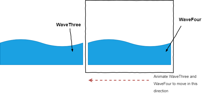
The basic idea for this is to have four waves and animate them infinitely. The first 2 waves, we will animate in one direction (eg going right to left). We need 2 waves SVGs to provide a smooth flow - no ‘gaps’ in the animation:
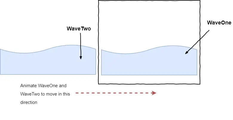
The other 2 waves we will put them behind the first two and animate them in the opposite direction (eg going left to right)
Step 1 - starting HTML
I started with the following HTML - I found the SVG for the waves from a online SVG generator (didn’t come up with the numbers myselft :)):
<div class="waves">
<div class="wave wave-dark">
<div class="water"><svg xmlns="http://www.w3.org/2000/svg" viewBox="0 0 350 32" preserveAspectRatio="none">
<title>wave1</title>
<path d="M350,17.32V32H0V17.32C116.56,65.94,175-39.51,350,17.32Z"></path>
</svg></div>
<div class="water"><svg xmlns="http://www.w3.org/2000/svg" viewBox="0 0 350 32" preserveAspectRatio="none">
<title>wave2</title>
<path d="M350,17.32V32H0V17.32C116.56,65.94,175-39.51,350,17.32Z"></path>
</svg></div>
</div>
<div class="wave wave-light">
<div class="water"><svg xmlns="http://www.w3.org/2000/svg" viewBox="0 0 350 32" preserveAspectRatio="none">
<title>wave3</title>
<path d="M350,17.32V32H0V17.32C116.56,65.94,175-39.51,350,17.32Z"></path>
</svg></div>
<div class="water"><svg xmlns="http://www.w3.org/2000/svg" viewBox="0 0 350 32" preserveAspectRatio="none">
<title>wave4</title>
<path d="M350,17.32V32H0V17.32C116.56,65.94,175-39.51,350,17.32Z"></path>
</svg></div>
</div>
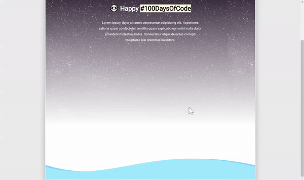
</div>This results in the following:
Step 2 - CSS to position waves
At the moment all of the waves are on top of each other. So I added the following CSS so that they would be at the bottom of the page and have the same X position.
Some notes:
wave-lightclass is the “front” wavewave-darkclass is the “back” wave and will have its animation in reverse.- Using
transform: translate(-100%, 0);to move wave 1 and wave 2 outside of the screen. This allows the horizontal animation to be smooth.
    .waves {
        bottom: 0;
        left: 0;
        width: 100%;
        height: 30%;
        overflow: hidden;
        transition: .4s transform ease;
        transform-origin: bottom center;

    }

    .wave {
        position: absolute;
        bottom: 0;
        left: 0;
        width: 100%;
        height: 100%;
        animation: wave 1.2s linear infinite;
    }

    .wave-light {
        z-index: 2;
        color: #59d4ff;
    }

    .wave-dark {
        z-index: 1;
        color: #3badfc;
        animation-direction: reverse;
    }

    .water {
        position: absolute;
        bottom: 0;
        left: 0;
        width: 100%;
        height: 20%;
    }

    .water svg {
        position: absolute;
        width: 100%;
        left: 0;
        right: 0;
        bottom: 99.9%;
    }

    .water:first-of-type {
        transform: translate(-100%, 0);
    }

    svg {
        fill: currentColor;
    }
Step 3 - Animate
The last step is to animate the waves. This uses a simple keyframe and moves the svgs along the X axis.
    @keyframes wave {
        0% {
            transform: translate3d(0, 0, 0);
        }

        100% {
            transform: translate3d(100%, 0, 0);
        }
    }
And there you have it. A wavy animation effect on the bottom of the screen. Hope you enjoyed this.