Creating gradient animation with CSS
In this post, I will go through on how to create gradient animations for your web design using linear-gradient CSS function and keyframes
Apr 12, 2022 | Read time 6 minutes🔔 Table of contents
In this post, I will go through on how to create gradient animations for your web design. Having the background gradient animations can make the design modern and grab the user’s attention at a specific area of the page.
For example, you can have a gradient background that animates on the hero or marketing section of the page.
We can also incorporate this into buttons or cards when people hover over.
How do we create background gradients?
Before figuring out how to animate the background, we first need to figure out how to create a background gradient. The simplest way to create a background gradient is with the CSS property:
background: linear-gradient(#e66465, #9198e5);linear-gradient is a CSS function that creates a image that transitions between two or more colours along a linear line (more info here: https://developer.mozilla.org/en-US/docs/Web/CSS/gradient/linear-gradient)
So for the above code, we have a background that has a linear gradient of start colour #e66465 and end colour of #9198e5
The linear-gradient function can be even more complex examples. For example you can specify the angle of 45 degrees and go from blue to red:
linear-gradient(45deg, blue, red);Another complex example is to specify the colour going from bottom to top, start with blue colour, turn green at 40% of the transition and finally finish transition into red:
linear-gradient(0deg, blue, green 40%, red);Background gradient animation with pure CSS
So now that we know how gradients work, we can add @keyframe animations to animate the gradient
The HTML that we need to create this effect is just making sure that we have body:
  <html>
    <body>
    </body>
  </html>
As with the CSS, it will look like the following. I will go through it line by line:
body {
	background: linear-gradient(-45deg, #ee7752, #e73c7e, #23a6d5, #23d5ab);
	background-size: 400% 400%;
	animation: gradient 5s ease infinite;
	height: 100vh;
}

@keyframes gradient {
	0% {
		background-position: 0% 50%;
	}
	50% {
		background-position: 100% 50%;
	}
	100% {
		background-position: 0% 50%;
	}
}
The body stying, we use background: linear-gradient(-45deg, #ee7752, #e73c7e, #23a6d5, #23d5ab);. This means that we want the background to have a linear gradient of
negative 45 degrees. The background will have 4 colours - starting with #ee7752, #e73c7e, #23a6d5, and finally finishing with #23d5ab.
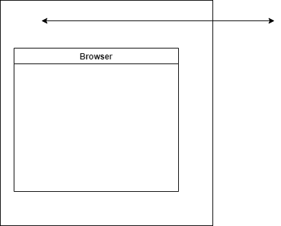
We also want the background to be huge: background-size: 400% 400%;. The basic idea is that we have a huge background with 4 colours. So when viewing the background, you can only see one
or two colours at a time. When we animate, we will move the background along the x axis (horizontal). This will give the impression that the gradient is animating.
To create the animation, we define the @keyframes gradient. This just animates the background along horizontally and repeats infinitely.
When the animation starts, we set background-position: 0% 50%;.
At the 50% @keyframe we move the background position 100% in the x axis (horizontal) and back to 0% at the end of the animation.

Note: that we need to move 100% along the x position when we are at the 50% - this is because we are making our animation to be infinite. Moving along to 100% of the x axis at the end of the animation will make it look janky.
Browser support
Since this technique relies on the linear-gradient function - it is mostly supported across modern browsers - even IE 10 and 11. Lower versions of IE will need to use the property:
-ms-filter: progid:DXImageTransform.Microsoft.Gradient()
Additionally keep in mind the angle parameter! Based on the MDN spec, value of 0deg is equivalent to to top; when we increase the values rotate clockwise from there.
Eg:
linear-gradient(0deg, blue, green 40%, red);
However with some browser versions such as Safari or Opera angle is treated differently. For example on Safari 5-6, and Opera browsers, the angle starts to the right, instead of the top. For example, it considered an angle of 0deg as a direction indicator pointing to the right.
More information on support can be found here: https://caniuse.com/mdn-css_types_image_gradient_linear-gradient
Some tips
- Keep in mind animation principles with this since having too much of this in your design can ruin it. Make sure this effect supports your content - eg not animate for its own sake.
- Make sure to use appropriate colours and contrasts. Keep to save web accessible colours to not disorient and confuse the user. For our example above, I would prefer to have white text for the purple/ blue background to keep high contrast.
- Keep performance in mind when using this technique. Having
@keyframeswill add to your site’s performance cost and can reduce it further if you have a lot objects animating at the same time.
Final thoughts
Animating backgrounds with CSS can be a great way to grab a user’s attention or bring a design to be more modern.
We can acheive this by using a combination of linear-gradient CSS function and @keyframes. The basic idea is that we have a huge background with 4 colours that transition to create the
gradient background. We will then animate this infinitely by moving the background horizontally - back and forth.
When coding this, make sure to keep in mind to use it sparingly, understand the colours, contrast and performance issues that could pop up.
Additionally since this technique relies on CSS gradient functions, we need to consider and cater for different browsers such as internet explorer, Safari, and Opera.