[Fixed] @media query in CSS not working issue
CSS media queries are an incredibly useful tool for targeting specific devices, resolutions, and other factors. We will go over steps to fix media query issues
Dec 4, 2022 | Read time 8 minutes🔔 Table of contents
CSS media queries are an incredibly useful tool for targeting specific devices, resolutions, and other factors when creating a website.
This is good for overall responsive design.
However, when they don’t work, it can be incredibly frustrating.
Steps to fix CSS media queries issues include the following:
1.Check your media query syntax
The most common cause of media queries not working is incorrect syntax. Make sure that you’ve got all the correct characters in the correct order. It’s also important to make sure that you’re using the correct syntax for the version of CSS you’re using.
2. Check to see if you are using the right break points It’s also important to make sure that we are using the right break points (and orientation) for the devices we want to test. For example, mobile phones such as iPhones will have lower breakpoints.
3. Make Sure the Media Queries Are in the Correct Order
The order of your media queries is also important. Generally speaking, you want to put the most specific media query first and the most general one last in your CSS file.
4. Check for Conflicting Styles - Check you dont have conflicting breakpoints or not logical operators
5. Are you using the HTML viewport meta tag? eg <meta name="viewport" content="width=device-width, initial-scale=1" />
Check your media query syntax
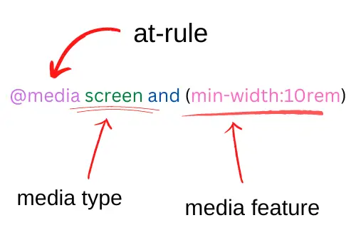
CSS media query follows the syntax of having starting with the @media at-rule and then followed by media type (screen, print, all) and a bunch of media features:
@media screen and (min-width: 30em) and (orientation: landscape) {
  /* CSS rules here */
  p {
    font-size: 0.5rem;
  }
}
So in the above example, we can see that the media type is screen and the media features are min-width: 30em and orientation:landscape.
Just means that the CSS that this media query is targeting should be for screens and the devices with min-width of 30em and orientation mode.
Some common mistakes with syntax when using media queries:
- Spelling mistakes - since its a fair chunk of code to type out, check that you have the right spelling. Tools like VSCode can help with this.
- Using commas means different things. Take the following example:
@media only screen and (min-width: 600px), screen and (max-width: 601px) {
    li {
        display: inline;
        padding-left : 5%;
        padding-right: 5%;
    }
}
The above means that we are declaring two different media queries. If we want to target min-width of 600px and max-width of 601px, we should re-write it as follows:
@media only screen and (min-width: 600px) and (max-width: 601px) {...Check to see if you are using the right break points
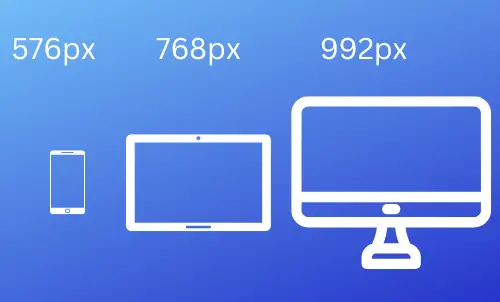
Our website can be accessed on a wide range of devices (tablets, phones, desktop), having break points we can define specifically how our website looks on each.
When doing responsive first design (design for mobile first and then move up), it is prefered to follow the below set of breakpoints as a general rule.
// X-Small devices (portrait phones, less than 576px)

// Small devices (landscape phones, 576px and up)
@media (min-width: 576px) { ... }

// Medium devices (tablets, 768px and up)
@media (min-width: 768px) { ... }

// Large devices (desktops, 992px and up)
@media (min-width: 992px) { ... }

// X-Large devices (large desktops, 1200px and up)
@media (min-width: 1200px) { ... }

// XX-Large devices (larger desktops, 1400px and up)
@media (min-width: 1400px) { ... }
Check out the following table for breakpoints for specific devices and their orientation
| Device | Device width (portrait) | Device height (landscape) | Pixel ratio |
|---|---|---|---|
| HTC One | 360 | 640 | 3 |
| Samsung Galaxy S2 | 320 | 534 | 1.5 |
| Samsung Galaxy S3 | 320 | 640 | 2 |
| Samsung Galaxy S4 | 320 | 640 | 3 |
| Samsung Galaxy S5 | 360 | 640 | 3 |
| LG Nexus 4 | 384 | 592 | 2 |
| LG Nexus 5 | 360 | 592 | 3 |
| Asus Nexus 7 | 601 | 906 | 1.33 |
| iPad 1 and 2 | 768 | 1024 | 1 |
| iPad Air, iPad Mini, iPad Pro 9" | 768 | 1024 | 1 |
| iPad 3 and 4 | 768 | 1024 | 2 |
| iPad Air, iPad Mini, iPad Pro 9" | 768 | 1024 | 1 |
| iPad Pro 10" | 834 | 1112 | 1 |
| iPad Pro 12" | 1024 | 1366 | 1 |
| iPhone 3G | 320 | 480 | 1 |
| iPhone 4 | 320 | 480 | 2 |
| iPhone 5 | 320 | 568 | 2 |
| iPhone SE | 320 | 568 | 2 |
| iPhone 6, 7, 8, X | 375 | 667 | 2 |
| iPhone 6 Plus | 414 | 736 | 3 |
| Huawei Ascend P6 | 360 | 592 | 2 |
| Huawei Ascend P7 | 360 | 592 | 3 |
| OnePlus One | 360 | 640 | 3 |
| HD laptops | 1366 | ||
| 13" MacBook Pro | 1440 |
(Note: the values are in pixels)
Make Sure the Media Queries Are in the Correct Order
Make sure that the standard CSS declarations are above the @media query definition. Take the following example:
.test{
    font-size:180px;
}

@media screen and (max-width: 350px) {
    .test{
        font-size:120px;
    }
}
If we have the .test class below our @media query, then it will not apply the font-size:180px property.
Check for Conflicting Styles
Media queries allows you to build up logical operators (using things like and and not). This can lead to confusion and conflicts within your styles.
An example is specifying conflicting widths:
/* ❌ Not working due to min width will conflict with max-width*/
@media all and (min-width:300px) and (max-width:200px) {
  /* … */
}
As another example, when using the not logical operator, it will apply to the whole media query and not individual attributes. Lets say we want to target all
media types (screen, print, et) and only for monochrome browsers:
@media all and (monochrome) {
  /* … */
}
Now if we add a not operator, it will apply to the whole media query (not individual attributes):
@media not all and (monochrome) {
  /* … */
}

/* ✔️ This will be the same as the above*/
@media not (all and (monochrome)) {
  /* … */
}

/* ❌ Not the same as above - since "not" will always apply to the whole query */
@media (not all) and (monochrome) {
  /* … */
}
Are you using the HTML viewport meta tag?
Typically, not all devices have the same width, so in our HTML we need to specify the following meta tag:
<meta name="viewport" content="width=device-width, initial-scale=1" />In the above, we just specify the width to adhere to the device-width and the zoom (initial-scale) to be the default of 1.
💡 Tip: When emulating devices in chrome, make sure to also add the minimum-scale:
<meta name="viewport" content="width=device-width, initial-scale=1, minimum-scale=1" />
Summary
Hopefully, these tips will help you to get your media queries working properly. Remember to double-check your syntax, make sure that there are no conflicting CSS styles (min and max width breakpoints), check that you are using the HTML meta viewport tag, check for correct breakpoints. Good luck!