CSS Animation Reverse not working?
Go through a few reasons why CSS reverse animations is not working with the animation-direction CSS property
Dec 22, 2021 | Read time 6 minutes🔔 Table of contents
This article will go through a few reasons why CSS reverse animations is not working. A common use case for when you want to
reverse a CSS animation is when someone clicks on a button, a tooltip will appear. The next click will then hide the tooltip.
For example, in the below codepen, a vertical menu will appear when you click on the button. The next click will hide the menu.
As shown in the above, a common pattern is to have 2 @keyframe animations. We will have one animation for the forward playback. And another animation
for the reverse playback.
Possible issue #1 - CSS overrides
To reverse an animation, you will need to use the animation-direction CSS property. This property takes the following possible
values to indicate whether the animation should be played forwards, backwards, repeated, etc:
animation-direction: normal;
animation-direction: reverse;
animation-direction: alternate;
animation-direction: alternate-reverse;
Another way to declare it is to use the animation CSS shorthand.
/* @keyframes duration | easing-function | delay | iteration-count | direction | fill-mode | play-state | name */
animation: 3s ease-in 1s 2 reverse both paused slidein;
In the above we want to have an animation thats 3 seconds using the “ease-in” function, delayed 1 second, iterate twice, reversed, filled for both, currently paused
and uses the “slidein” @keyframe
Now your animation will not reverse if you declare your animation-direction property before the shorthand animation CSS property.
As an example, take the following style
.block {
  animation-direction: reverse;
  animation: 3s ease-in 1s 2 normal
}
From the above example, we can see that the animation-direction is declared as reverse on the top line, but then it will
be overwritten with the second shorthand animation property - changing to “normal”.
Possible issue #2 - Not specifying the browser prefixes
CSS vendor prefixes are browser specific CSS prefixes before a CSS property to allow browsers to support new
and upcoming CSS functionality. We have the following set of prefixes for each browser type:
- -webkit- (Chrome, Safari, iOS, Android)
- -moz- (Firefox)
- -ms- (IE)
- -o- (Opera)
To use the prefixes, we add the above to our CSS as follows:
-webkit-animation-delay: 3s;
-moz-animation-delay: 3s;
-ms-animation-delay: 3s;
-o-animation-delay: 3s;
animation-delay: 3s;
So when you are using the animation-direction CSS property at least add the following prefixes so that the browser
can recognise them. As an example, without the -moz- prefix, specific version of firefox, the animation delay will
not work for the user.
At the time of writing the animation-direction CSS property should be available for the most recent versions of all browsers.
Possible issue #3 - Trying to use the same @keyframe animation for both forward and reverse animation
A common use case for reversing animations is to reuse the same @keyframe animation, but when you define the animation on the element
you will change it to “reverse”. So lets consider the following CSS:
@keyframes line-in {
  0% { transform: translateY(-100px); }
  50% { transform: translateY(0); }
  100% { transform: rotate(-135deg); }
}

.line.active {
  animation-direction: normal;
}

.line {
  animation-direction: reverse;
  animation-name: line-in;
}
The intention of the above is to reverse the animation when we add the active class. This will not work because of the following issues.
- Animations will start from 0% and then to 100% - as seen below, the animation will flow through a timeline as follows:
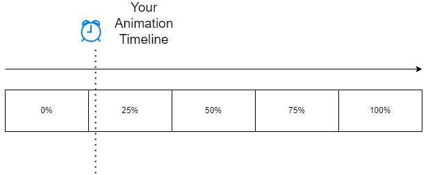
- When the active class is applied to the element, the **animation-direction ** “reverse” is applied, but you will not see the effect of reversing the animation. This is because the animation already finished at 100% in the timeline!
So to get it to actual reverse the animation, we need to apply some trickery.
- Reset the animation by clearing the class
- Trigger a DOM reflow - this is a operation taht forces the browser to recalculate the layout of the document and therefore reset any animations.
var element = document.getElementById("myElement");
element.classList.remove("line");
element.classList.remove("active");

// DOM reflow hack
void element.offsetWidth;

element.classList.add("line");
element.classList.add("active");
Be warned - this type of action will be a performance hit. Its best practice to use the transition CSS property where possible or have two
different animations for forward and reverse.
Final thoughts
When animating with CSS, there are use cases when you want to reverse an animation. For example, showing a menu on a button click, and then hiding it
on the next click. We use the animation-direction CSS property withto define if the animation should move forward, backwards or alternate.
Using the “reverse” reserved word, we can set the animation to be reverse.
Additionally we can use the shorthand animation CSS property to define a reverse animation. Issues can arise when we are not carefull with setting
the order of the CSS animation-direction property vs the shorthand version, not using the correct browser prefix, or reusing the same
@keyframe animation. We can get around issues with reusing @keyframe animations, but it is best practice to separate animation @keyframes or use
transition CSS property.