How to create a speech bubble with CSS
How to create speech bubble with CSS and HTML. Speech bubbles can be used for testimonials or tooltips.
Dec 20, 2021 | Read time 5 minutes🔔 Table of contents
In this article, we will go over how to create a speech bubble with a bit of CSS and HTML.
Before modern CSS, creating a speech bubble had tp involve a image or using JavaScript to inject DOM elements.
We will go through a few examples of different speech bubbles to show how they can be used on your
web design.
What are speech bubbles and when they are useful?
Speech bubbles are quite useful UI component that can improve your website design. They can be used
for testimonials, chat text/ timeline, or even tooltip and help text when the user hovers over a button
or image.
A basic speech bubble
To create a basic speech bubble, we just need to make use of a HTML element and the ::after pseudo element.
See the below codepen for the full code and how it looks.
So for the above example we will start with the following HTML. A basic DIV with some text in the middle.
<div class="speech-bubble">
  <h1>Hello</h2>
  <p>How are you!</p>
</div>
Now we style the CSS speech-bubble class. We just want to make the text to be white and aligned in the
middle of the speech bubble. Additionally we set the bubble to have rounded corners and a blueish background
color.
.speech-bubble {
  position: relative;
  background: #00aabb;
  border-radius: .4em;
  width:300px;
  display:flex;
  flex-direction:column;
  align-items:center;
  color:white;
}
The tricky part is the arrow below the bubble. To do this we use a pseudo element ::after. You can use ::before or another
element, but I find using ::after is a bit cleaner.
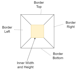
Now our approach is to have a box of 0 width and 0 height. Then we only color in the “top” border and hide the other border edges (left, right, bottom borders)

The CSS will look like the below. One other thing of note is the use of “absolute”. This makes sure that the arrow appears correctly a the bottom
of the bubble.
.speech-bubble:after {
  content: '';
  position: absolute;
  bottom: 0;
  left: 50%;
  width: 0;
  height: 0;
  border: 20px solid transparent;
  border-top-color: #00aabb;
  border-bottom: 0;
  margin-left: -20px;
  margin-bottom: -20px;
}
Example #1 - Testimonial CSS speech bubble
In the following example, we use the same method as above to create a testimonial speech bubble. Testimonials can improve the
design of your landing pages.
For this example, the arrow is to the point to the left. To get this effect, we still show the top border, but now hide left border.
Additionally for this example, instead of using the pseudo ::after element, we can use a div instead
Example #2 - Speech Bubble on button hover (Tooltip)
Another example that speech bubbles can be of use is with tooltips. When the user hovers over a button,
a tooltip will appear (usually having some help text).
We follow the same pattern as in the basic example, but now the speech bubble will appear on the :hover state of the button.
When creating tooltips, we will need to consider mobile or devices that are not desktops. For example, on mobile hovers will not be available
and only able to work with touch events.
Additionally on smaller screens the tool tip needs to be visible within the viewport - eg the tooltip might not be visible if the button is too
high up the device’s screen. In this case we need to consider the screen position and place the tooltip accordingly (eg bottom, left, right)
Concluding thoughts
Speech bubble are a great way to spice up your website design. They can be used on your landing pages to show
customer testimonials, displaying a timeline for chats text between users or even use a tooltips when the user
hovers over a button or element.
The trick to creating speech bubbles with CSS is using the ::after pseudo element and showing or hiding the top, left,
right, bottom borders.